
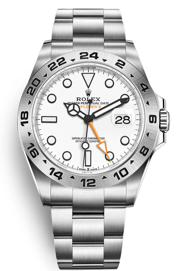
White dials are unforgiving. On a dark dial, small differences in print weight or marker alignment can disappear in reflections; on a white dial, they tend to stand out. That is why white-dial Rolex replicas are useful for studying the quality of hands, outlines, minute tracks and date displays. The previous version of this article used broad “best fake watches” language. This update turns it into a model comparison rather than a sales list.
Explorer II Polar puts contrast under a microscope
The current Rolex Explorer II reference 226570 is a 42 mm Oystersteel watch with a fixed 24-hour bezel and a white dial. Its orange 24-hour hand is not decorative: together with calibre 3285 it supports the second-time-zone display. On a replica, the important visual points include the black surrounds of the hands and markers, the orange tone and length of the 24-hour hand, the date position and the relationship between the dial and fixed steel bezel.
A white Explorer II dial should look clean rather than blue or cream under neutral light. The black outlines need to be crisp without looking overly thick. Because the bezel does not rotate, alignment between the printed dial and engraved 24-hour scale is easy to compare.
Daytona white dials are about subdial balance
A white-dial Daytona introduces a different problem: three chronograph counters occupy much of the dial. The eye quickly notices incorrect spacing, counter diameter or ring thickness. The hands should not overwhelm the markers, and the “DAYTONA” text around the six-o’clock counter needs the correct scale relative to the rest of the print.
Chronograph function is also relevant. A watch can look convincing in a still image but reveal weaknesses when the start, stop and reset sequence is used. Pondwatch treats movement claims separately from dial accuracy because visual imitation and mechanical execution are different questions.
Datejust shows how subtle white tones can be
White, silver and mother-of-pearl Datejust dials are often grouped together in replica listings even though they behave differently in light. A plain white dial should be evaluated for print contrast and lume application. Silver has a metallic response that changes with angle. Mother-of-pearl is naturally variable and should not be judged from one photograph alone.
The Datejust also adds the Cyclops lens and date wheel to the comparison. Centring, magnification and font weight can make or break an otherwise clean dial.
A white dial does not automatically mean better legibility
Legibility depends on the contrast between hands, markers and dial, not simply on the dial being light. Polished hands can disappear against a bright surface at some angles, while black-edged hands remain easier to follow. The choice is part of the model’s design language.
For that reason, the most useful comparison is model by model rather than “white versus black” in the abstract. Readers can use Pondwatch’s Rolex category to compare reference-specific details without relying on generic claims that one dial colour is universally better.
 admin