

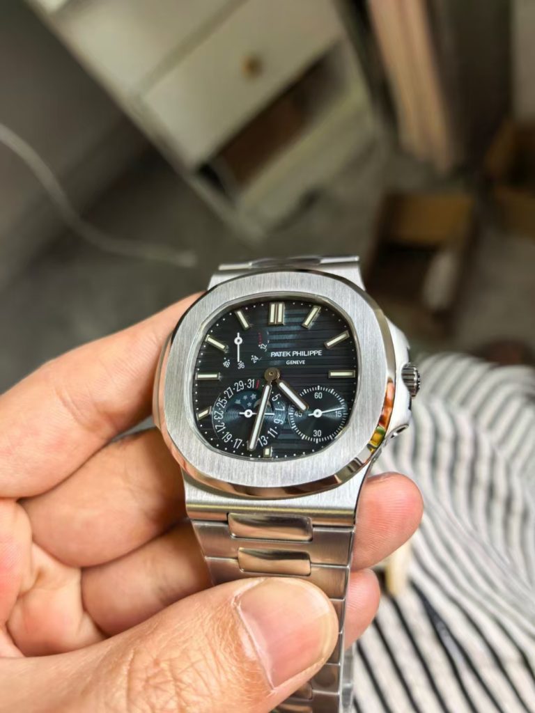
The Patek Philippe Nautilus 5712 is a difficult watch to imitate convincingly because the dial is doing several things at once. Its blue-grey tone changes with the light, the layout is deliberately asymmetrical, and the power-reserve display, moon-phase/date display and small seconds all compete for space without making the genuine watch feel crowded.
Earlier versions of this article included precise colour-difference figures, coating thicknesses, engraving depths and manufacturing claims that were not supported by independent documentation. Those numbers have been removed. This revised review concentrates on visual details that can actually be assessed from photographs and physical samples, while treating factory and movement claims with appropriate caution.
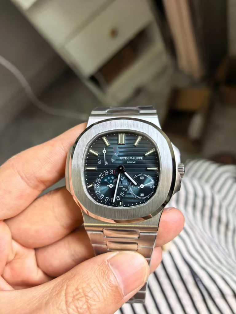
The dial colour is more complicated than a single shade of blue
A Nautilus 5712 dial should not be judged from one photograph. The radial brushing can make the surface move from blue to charcoal or grey depending on the angle and colour temperature of the light. Camera white balance can exaggerate those changes, which is why claims that one dial has a measurable colour advantage need controlled testing before they are treated as fact.
For a practical visual comparison, look at the dial in several lighting conditions and concentrate on whether the colour transition appears natural. A dial that turns strongly purple under ordinary indoor light, or one that remains flat and uniformly blue from every angle, will usually look less convincing than a surface with restrained blue-grey variation and visible sunburst structure.
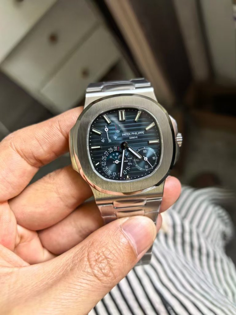
Subdial geometry matters as much as colour
The 5712’s asymmetrical layout is one of its defining features. The power-reserve indicator occupies the upper-left portion of the dial, while the small seconds and moon-phase/date display sit lower on the right. That arrangement means incorrect spacing is easy to notice. A subdial that is slightly too large or positioned too close to the centre changes the visual balance of the whole watch.
When comparing replica dials, check the distance between the central pinion and each complication, the relationship between the printed scales and applied hour markers, and the amount of open space around the moon-phase aperture. These proportions are more useful than broad claims that a dial is “near OEM”.
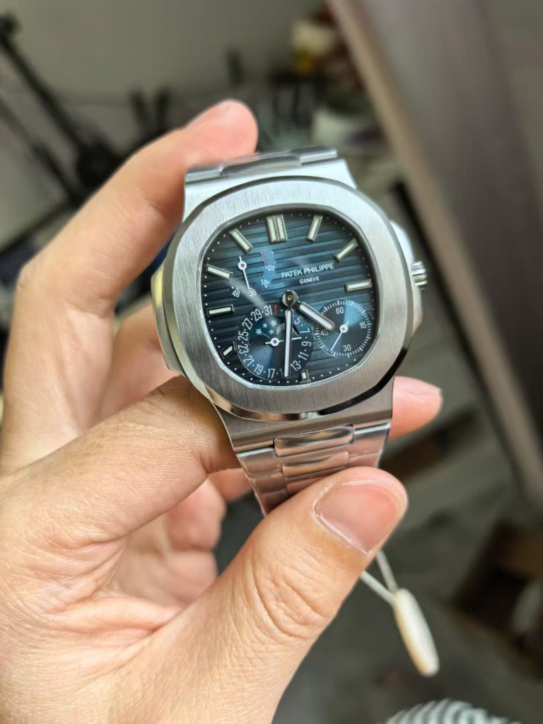
Printing, markers and hands
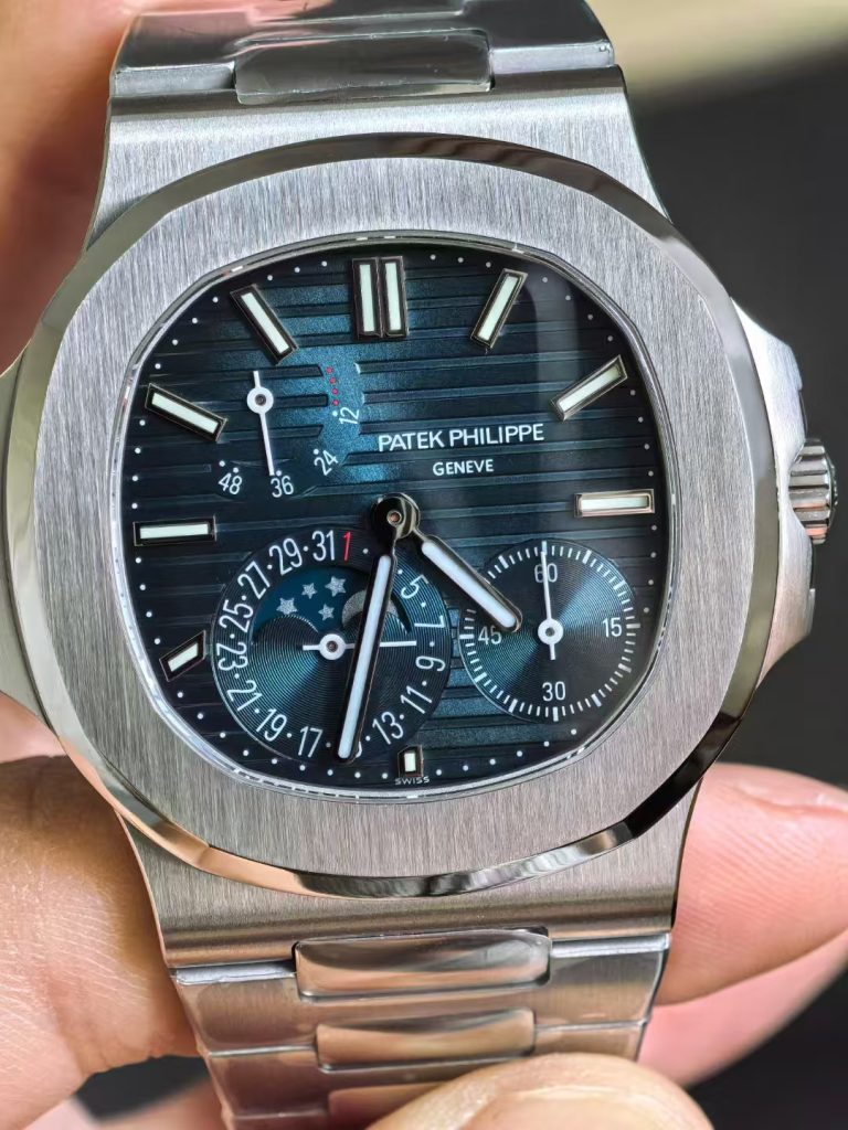
The applied markers should look clean and consistent, with a finish that responds evenly to light. Misaligned markers, heavy polishing or uneven edges become obvious on a dial with this much open space. The same applies to the hands: length, centre alignment and finishing matter more than marketing descriptions of the plating material.
Printed text and scale markings should remain sharp without appearing too heavy. On the power-reserve scale and subsidiary seconds, small inconsistencies in font weight or spacing can make a replica look busier than the genuine layout. Macro photographs are useful here, but they should be treated as visual evidence rather than proof of manufacturing tolerances.
Movement decoration should not be confused with movement architecture
Replica-market descriptions often focus on engraved bridges, rotor shape and decorative finishing visible through the case back. Those elements can be compared visually, but they do not establish that the underlying movement is constructed or performs like Patek Philippe calibre 240 PS IRM C LU.
Without documented testing, it is not responsible to state exact power-reserve figures, engraving depths or regulation performance for a particular batch. The useful editorial distinction is between what can be seen through the case back and what would require disassembly, timing equipment or manufacturer documentation to verify.
Comparing PPF, SW and other dial labels
Names such as PPF, SW and OME are commonly used in replica-watch discussions, but they are not a substitute for inspecting the actual sample in front of you. Production batches can change, photographs can be edited, and the same label may be used by different sellers in different ways.
A useful comparison therefore starts with the individual watch: dial tone in several lighting conditions, sunburst direction, marker placement, subdial spacing, printing and hand alignment. If a replacement dial is being discussed, the comparison should also consider whether the new dial changes the fit, date alignment or overall consistency of the watch rather than assuming an “upgrade” is automatically better.
A more reliable way to judge the 5712 dial
The biggest lesson from the 5712 is that visual balance matters more than impressive-sounding measurements. The dial should move naturally between blue and grey, the complications should sit in the correct visual relationship to one another, and the applied furniture should remain clean under close inspection. Those are details a reader can actually see and compare.
Pondwatch will treat future factory specifications as claims unless they can be independently verified. For more model-focused coverage, see the Patek Philippe archive.